Designed for letter-sized printing and online publication, the resume is styled around my studio branding. Colors are based on digital matches (PMS, CMYK, & RGB) to the markers I use for sketchnoting and hand-rendered visualizations. To learn more about my brand, visit this Behance gallery to see the brand elements, meanings, and creative process behind the development.
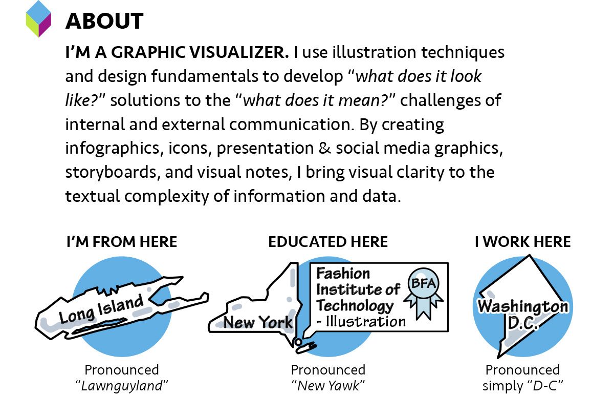
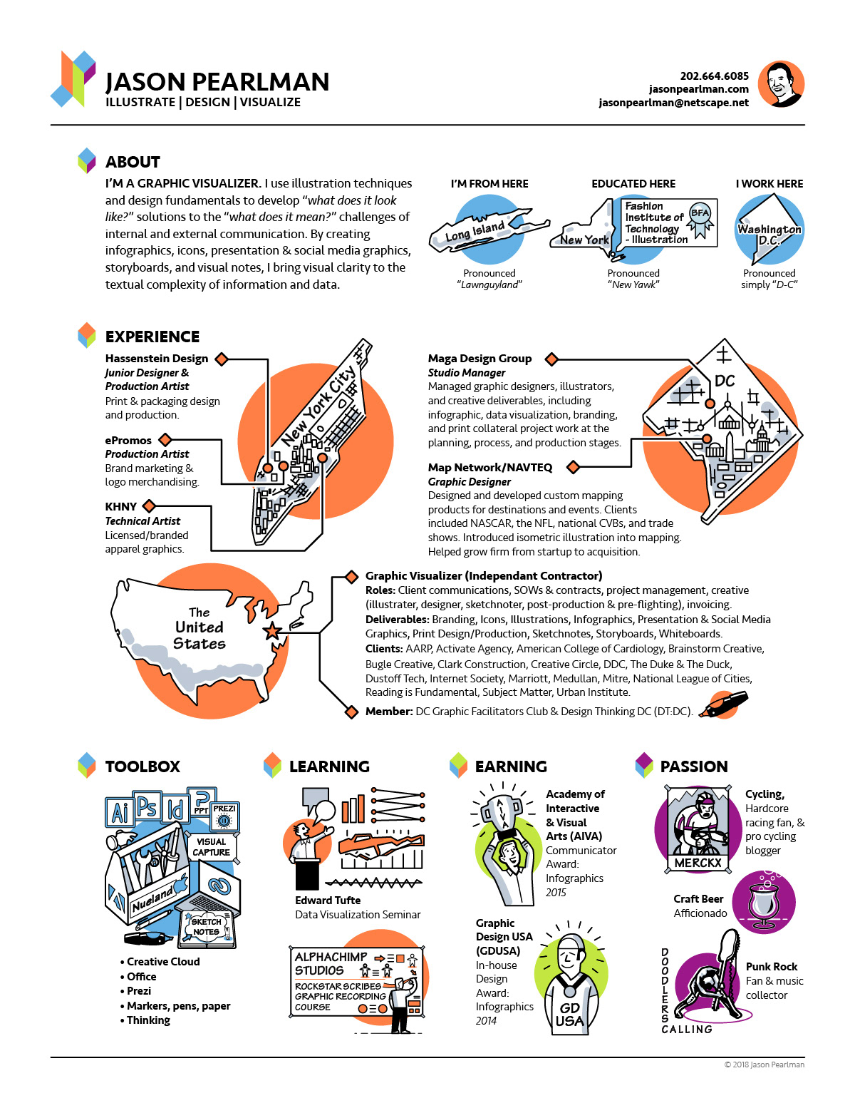
I created the term "Graphic Visualization" to describe combining illustration and design to represent information in a memorable visual formats. Words like "draw" and "idea" are vital to graphic visualization, even if my Long Island accent makes them sound funny!
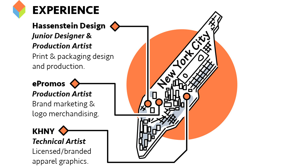
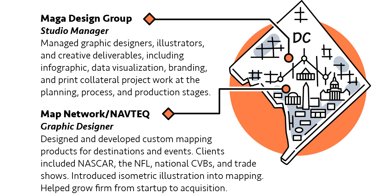
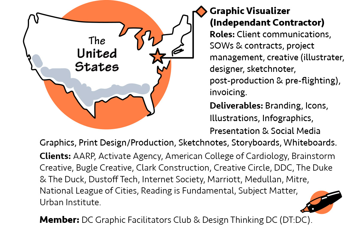
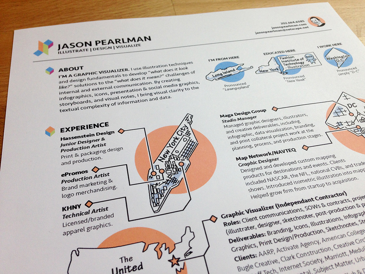
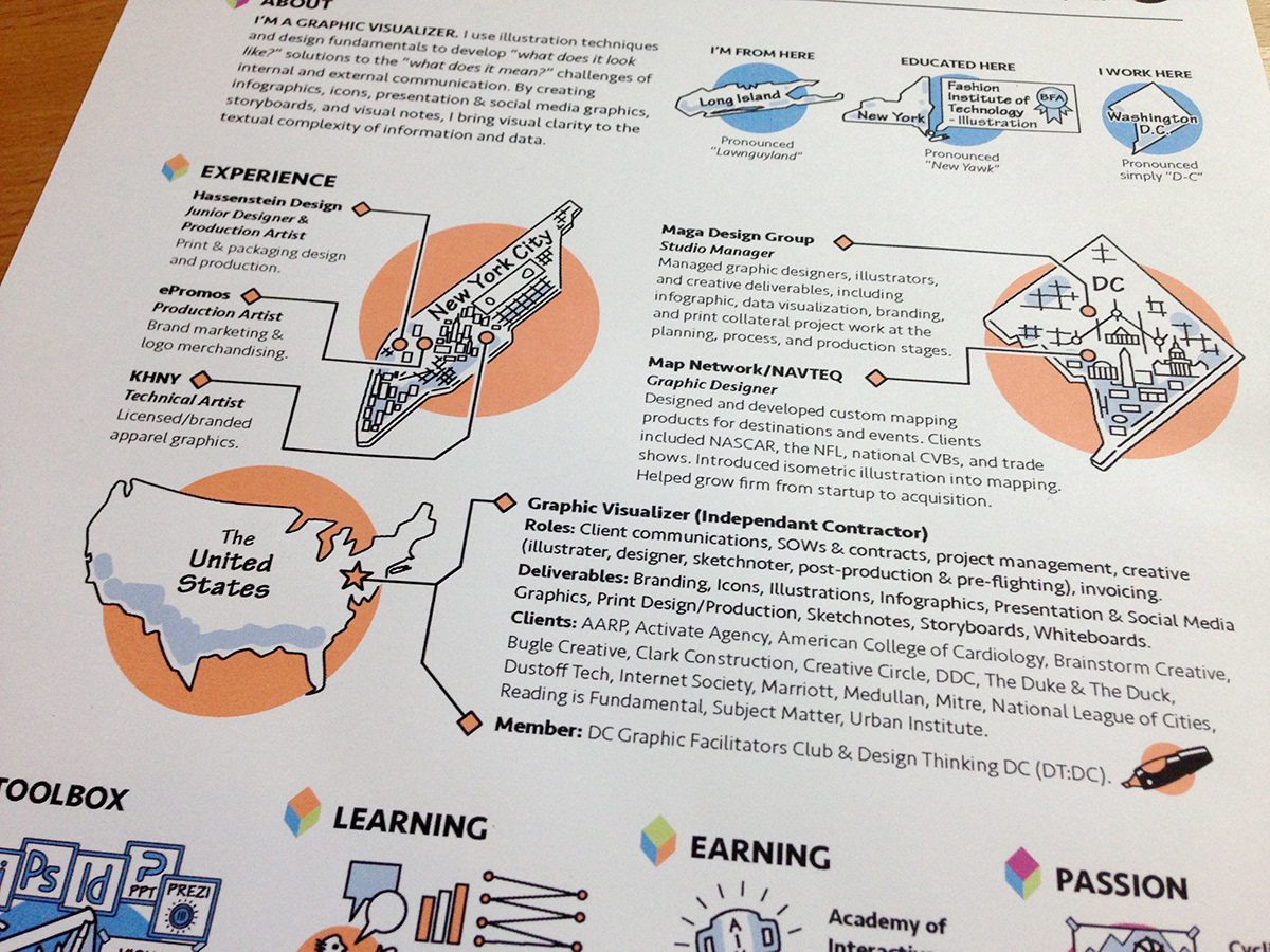
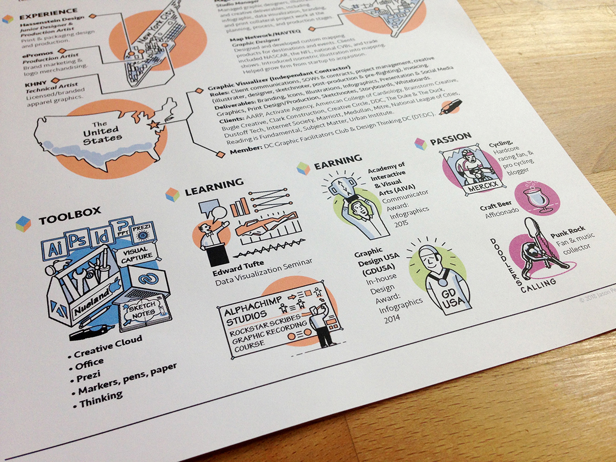
I love maps, and wanted to used them to tell the story of my career path and evolution.
Even in this tech-driven world, my work stems equally from analog and digital origins.
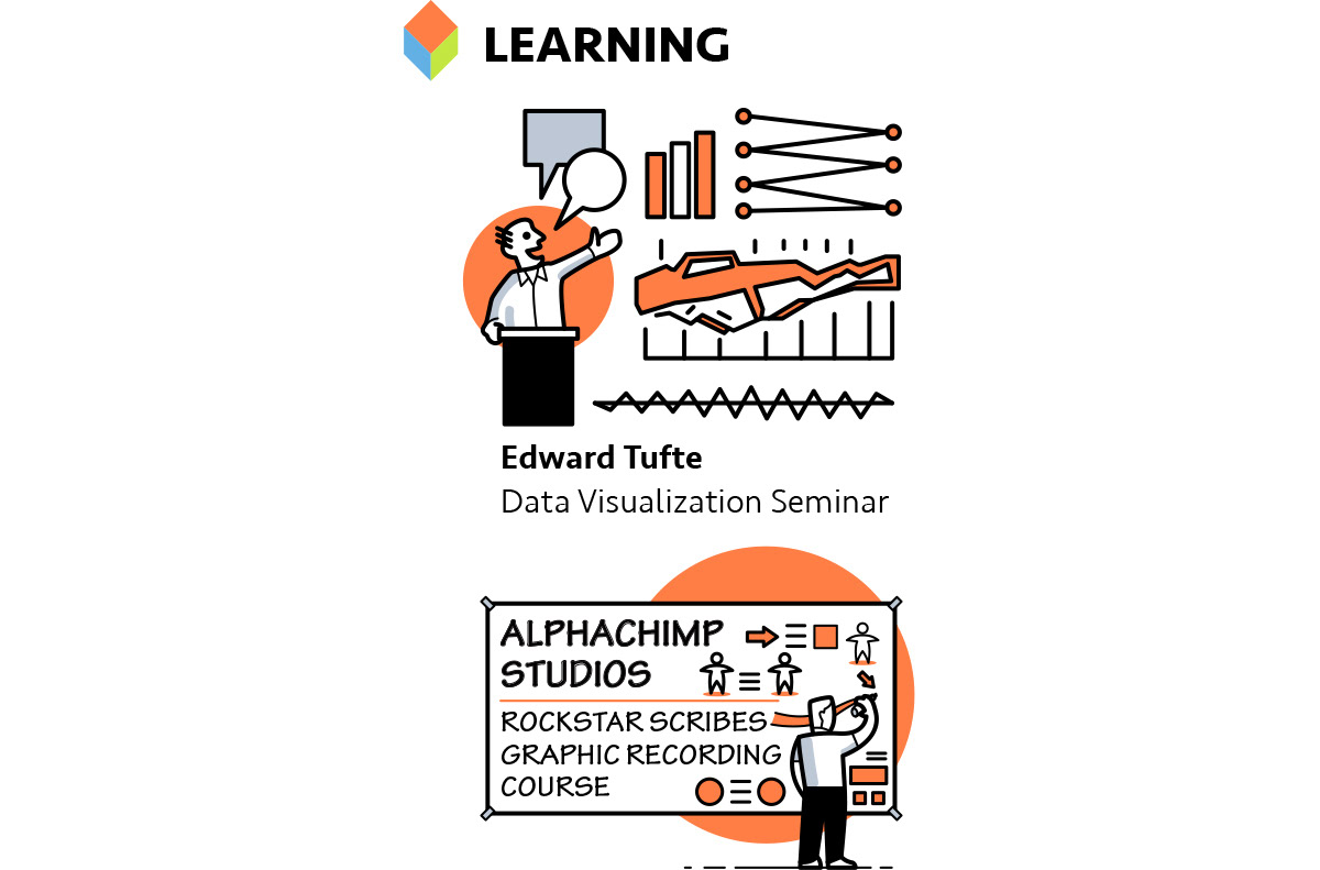
I've been fortunate to have learned from some great people over the course of my career, including Edward Tufte (data visualization), Scott and Rebecca Williams (data visualization and information architecture), Jim Nuttle (graphic recording), Stephanie Brown (graphic recording and facilitation), Karen Hold (design thinking), Diane Bleck (sketchnoting), Julie Anixter (branding and innovation), Susanne Hassentstein (graphic design, production art, European aesthetic), and Tony Cicollella (branding, creativity, design, fun with projects, and appreciating the art of a good potato chip!)
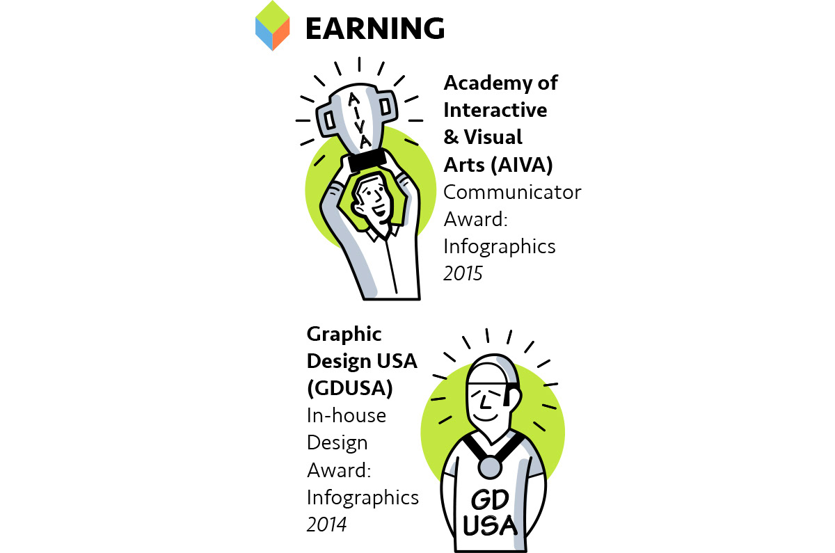
My goal with projects is to produce work on time, at or below budget, and at or above expectations. A job approved and appreciated by client, and a project that achieves the client's goals are the reward enough, though I'm always thankful for an official accolade.
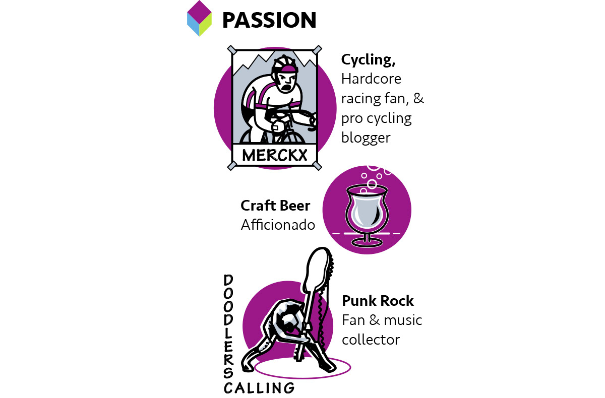
Passion drives passion, and my passions outside of the studio inspire my passion inside the studio. From cycling's commitment, focus, and incredible culture, to the craft beer scene's creative facets, and punk's unbridled creative expression, all of these push my studio and creative work to break through ruts and conventionalities in many ways.
I don't want my resume to be read; I want it to be looked at, thought about, and to act as a bridge between myself, my work, and the people involved with its very purpose.
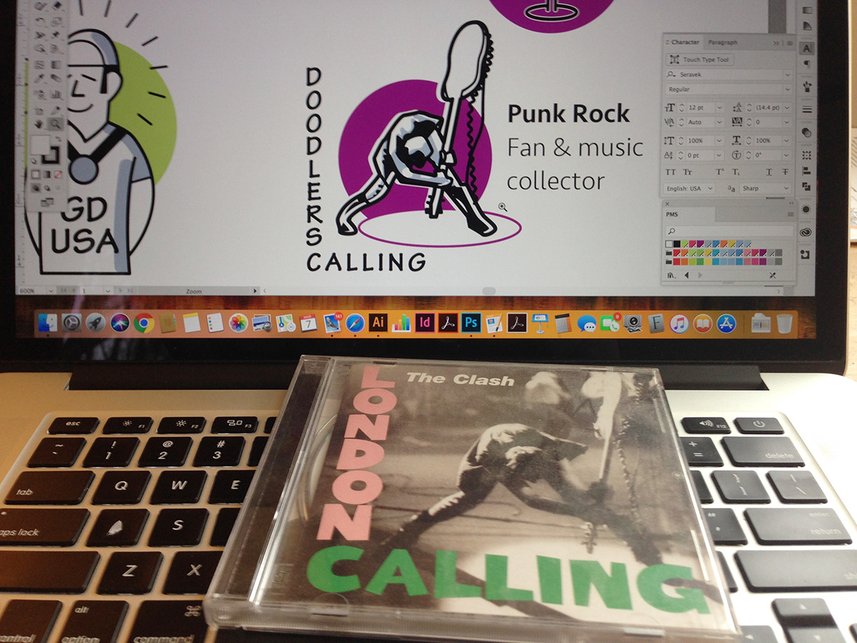
Why punk rock? Because punk's raw, visceral expression is the reason that 40 years later we're still listening to The Clash, while forgetting last year's studio-polished pop song. Communication should be same: visceral, impactful, and memorable. Reading isn't enough; looking truly engages and involves us with information and data. Songs like "London Calling” still scratch at our surfaces, permeate our senses, and remain in our heads today as much as they did in 1977. Your organization's vital messages may not be the same as Joe Strummer's lyrics, but they do need to live far beyond meetings and presentations, resonating to the point of attention and action. Text on Word Docs and bullet points on PPT slides aren't enough. Like punk's three chords and raw lyrics, graphic visualization's doodles, drawings, illustrations, and designs grab our attention, engaging us into action!