

How it happened...
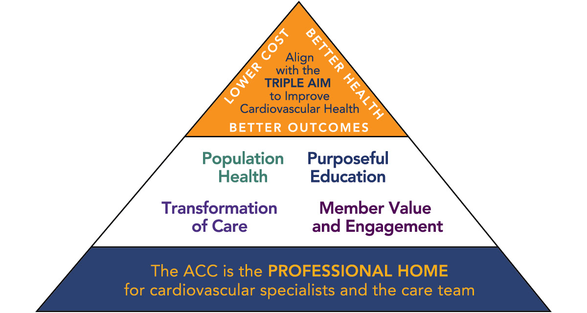
Though noble and respectable in their mission, the American College of Cardiology's Strategic Plan graphic was represented by a generic triangle structure built in Powerpoint. I was tasked with adding the ACC's branding colors and fonts, without altering the overall layout or structure, which is shown above.
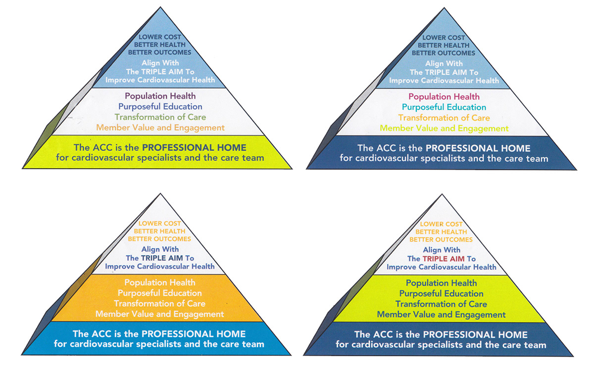
Next, I was asked to "jazz it up" a little, while still keeping the basic structure and branding styles. When I printed this version, the illustrator and visualization artist in me thought "nah; we can do better!"
So I took a pencil, and started doodling all over the original triangle graphic...
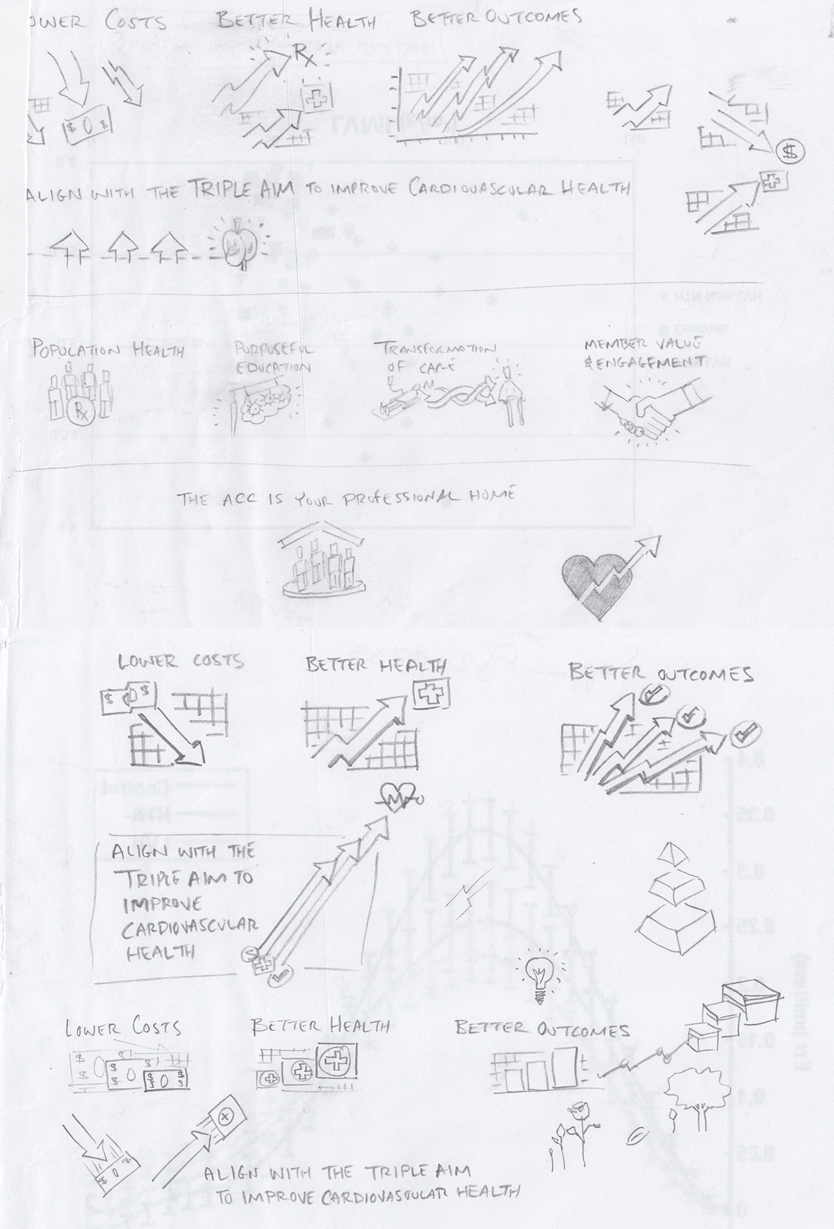
...which led to a selection of visual representations for the textual content of the original triangle graphic, evolving the concepts based on the style of sketchnoting and graphic recording.
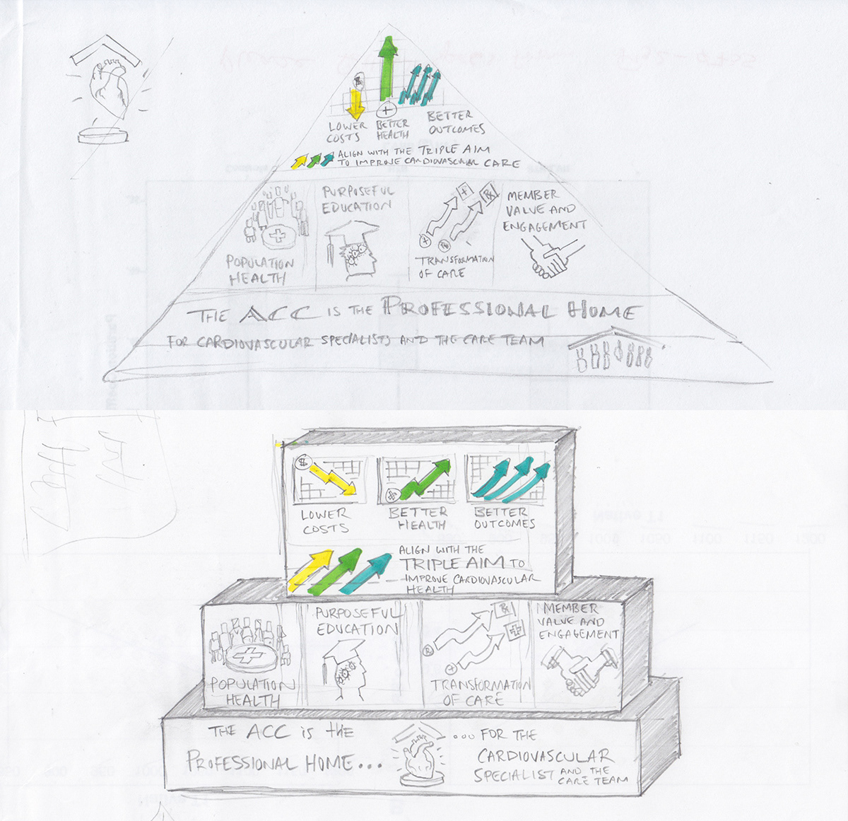
The initial visual exploration eventually led to these two concept designs. I presented them to the ACC's communication and marketing department as alternatives to the original triangle graphic, with the design on top ultimately being selected.
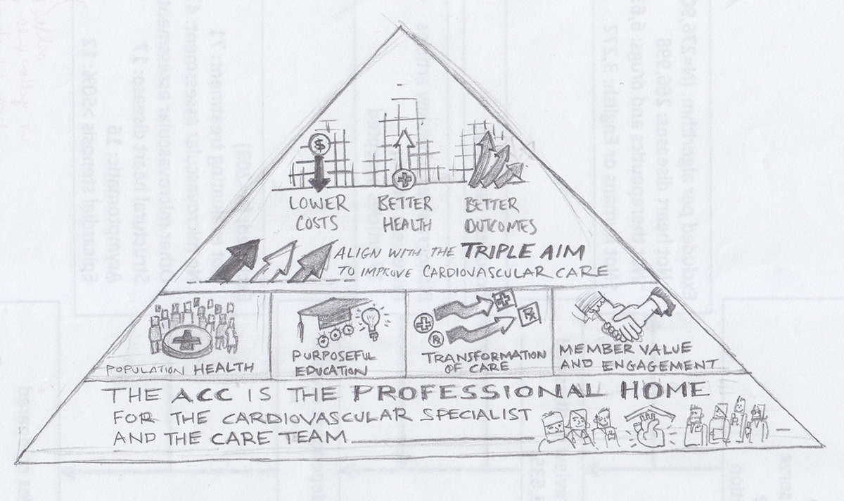
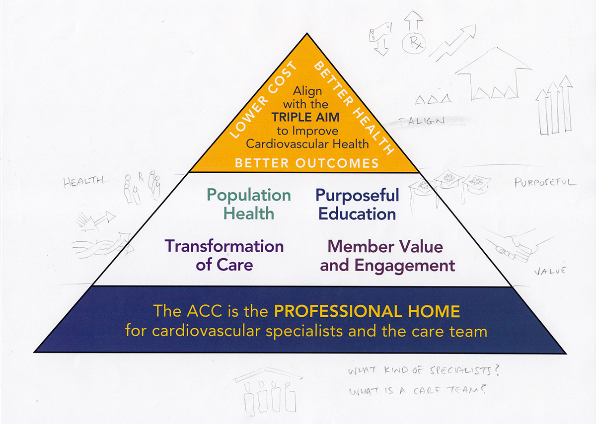
I created this rough draft ahead of the digital final. As the triangle represents a structural heirarchy, I had to solve the challenge of working with this layout, and created the visuals at the top to best work with the triangular space limitations (note: since I didn't have a sketchbook on hand at the College, I crafted my own out of extra prints from the copying machine, hence the 'ghosted" images behind the sketches.)
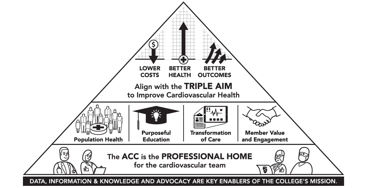
Here is the base digital linework for the redesigned Strategic Plan Triangle.
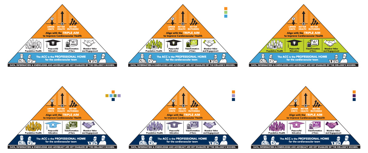
These are the color options that I presented, which is when I realized that green is not the best color for representing health (think back to those old cartoons, where sick people were depicted with green heads!)
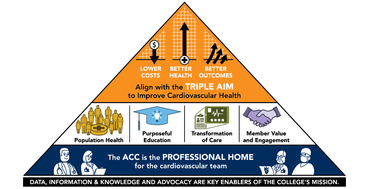
Here's the final redesigned American College of Cardiology Strategic Plan triangle. The original architecture/hierarchy of the layout have been retained, but now as an engaging and though-provoking visual presentation.
Thanks for viewing. To see more about this project, including process and production images, please visit this project at Behance.