

The content begins as MS Word and PPT-based content. The text is stripped out, and placed into Adobe illustrator, where the layouts are eventually completed.
Every element matters in these layouts; careful attention is placed on the size, shape, and direction of arrowheads, stroke widths, corner angles, shapes, and color fills of the boxes, and overall color consistency and hierarchy.
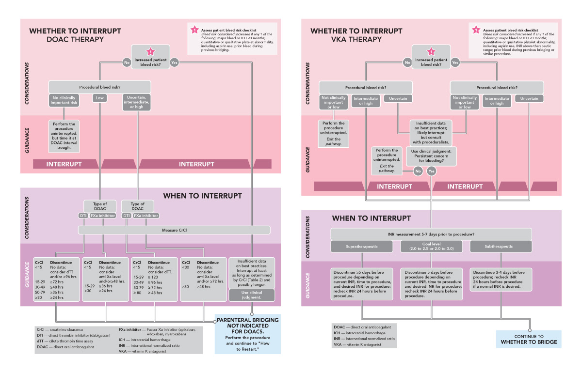
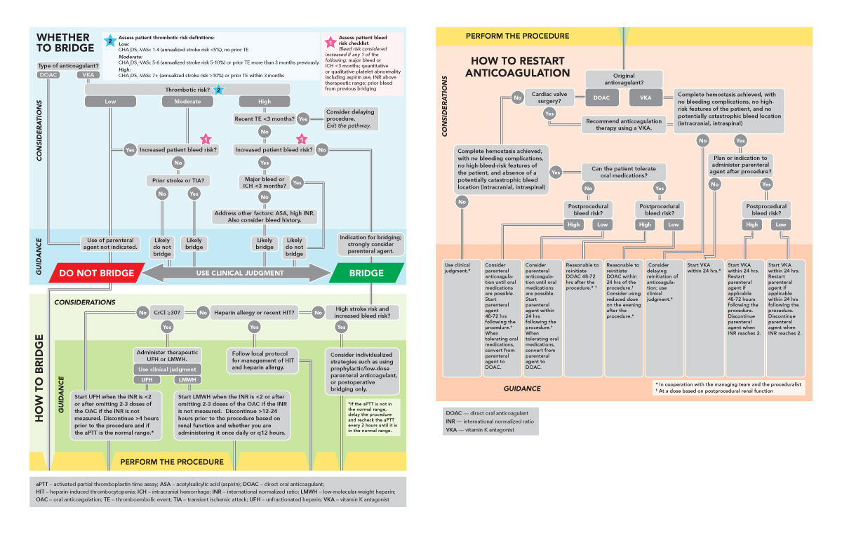
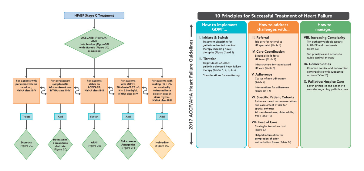
Some algorithms (also called "pathways") are highly complex in thier layouts, and extremely technical in their arrangements. Designing the placements take careful consideration and planning, especially in circumstances where the orientation of the original content (which may be a landscape PPT or even just a raw sketch) has to be adapted to match a particular page layout, without compromising the integrity and accuracy of the content.
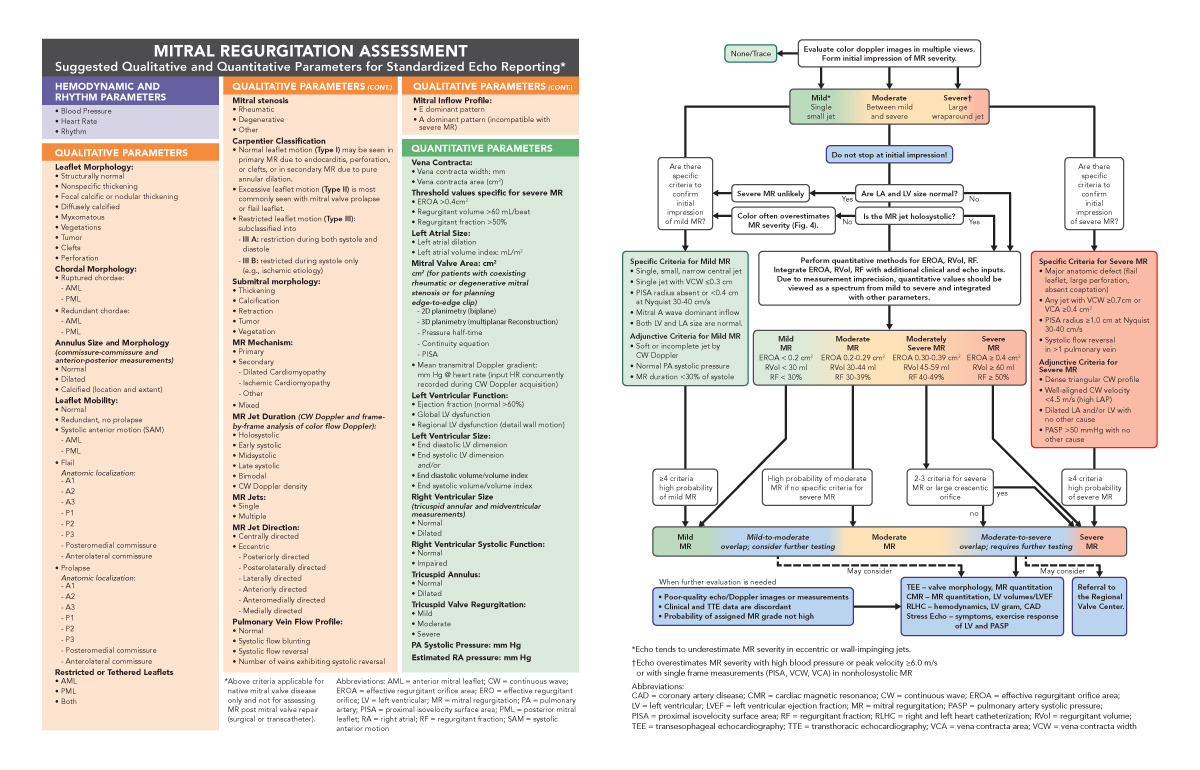
Attention to typography is crucial for the success of these layouts. As there is a lot of text for limited amounts of space, the copy none the less needs to be as easily readable as possible. Within all of the text seen here is finite attention to type size, line length, leading, indents, particular typeface usage, scientific symbols, scientific formulation, and overall consistency.
Accuracy of content must be nothing less that 100% correct. Understanding the language of the content is critical, especially when working with scientific symbolism and formulation. Within all of the content and text are complex spellings, numbering, glyph-based symbols and subscripted/superscripted numbers that need to be tracked, set, proofed, and maintained throughout the various stages of initial design, revisions, and final production.