
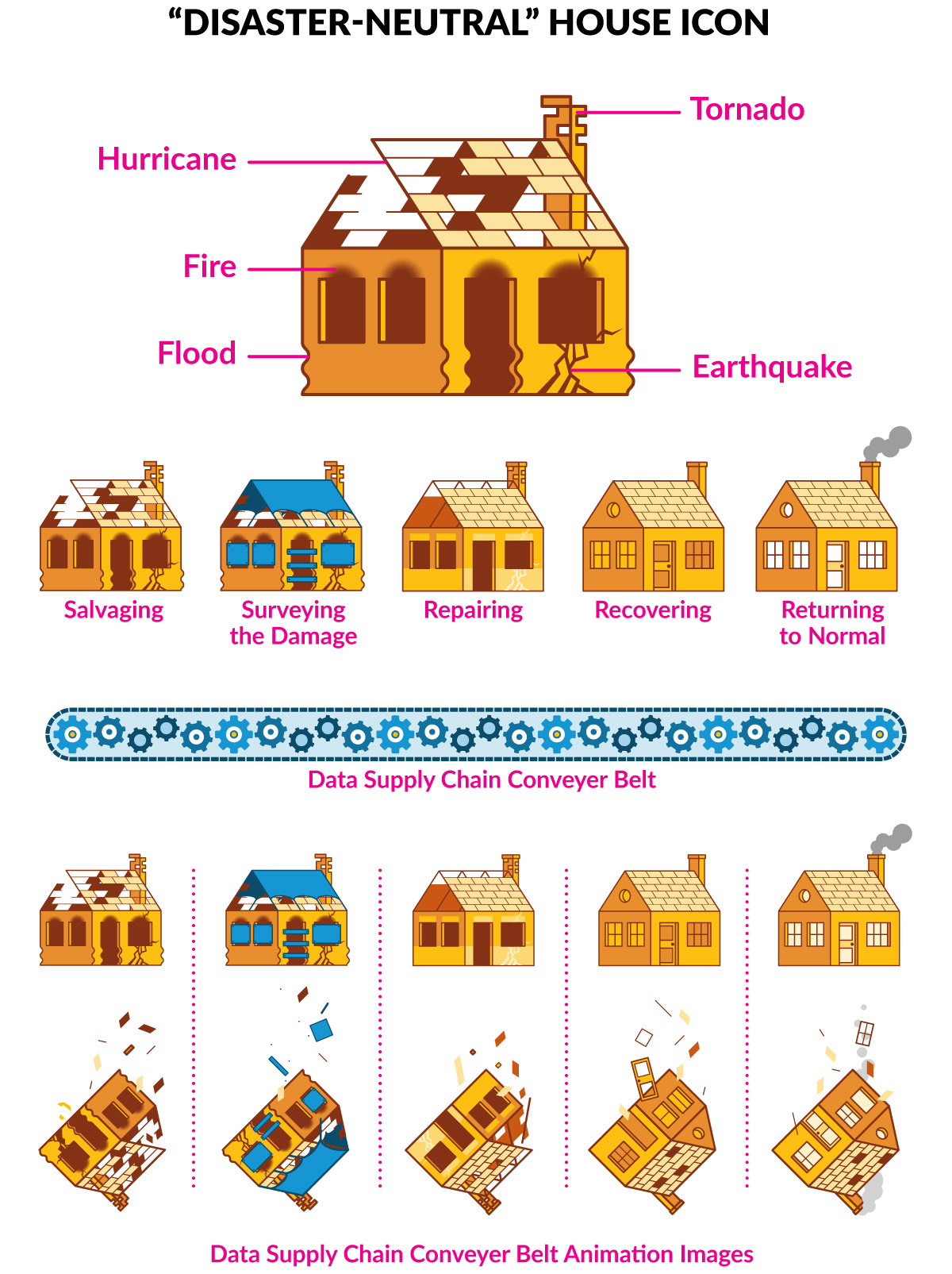
Icons built to represent the five stages (posts) of the Housing Data Supply Chain initiative. Since the initiative covers multiple disasters, the icons needed to be "disaster-neutral", hence the emphasis on the first house showing damage indicating hurricanes, flooding, fire, and earthquakes, amongst other disasters. The palette is based on the Urban Institute's style guide, with shades developed to allow for illustrative depth and detailing.
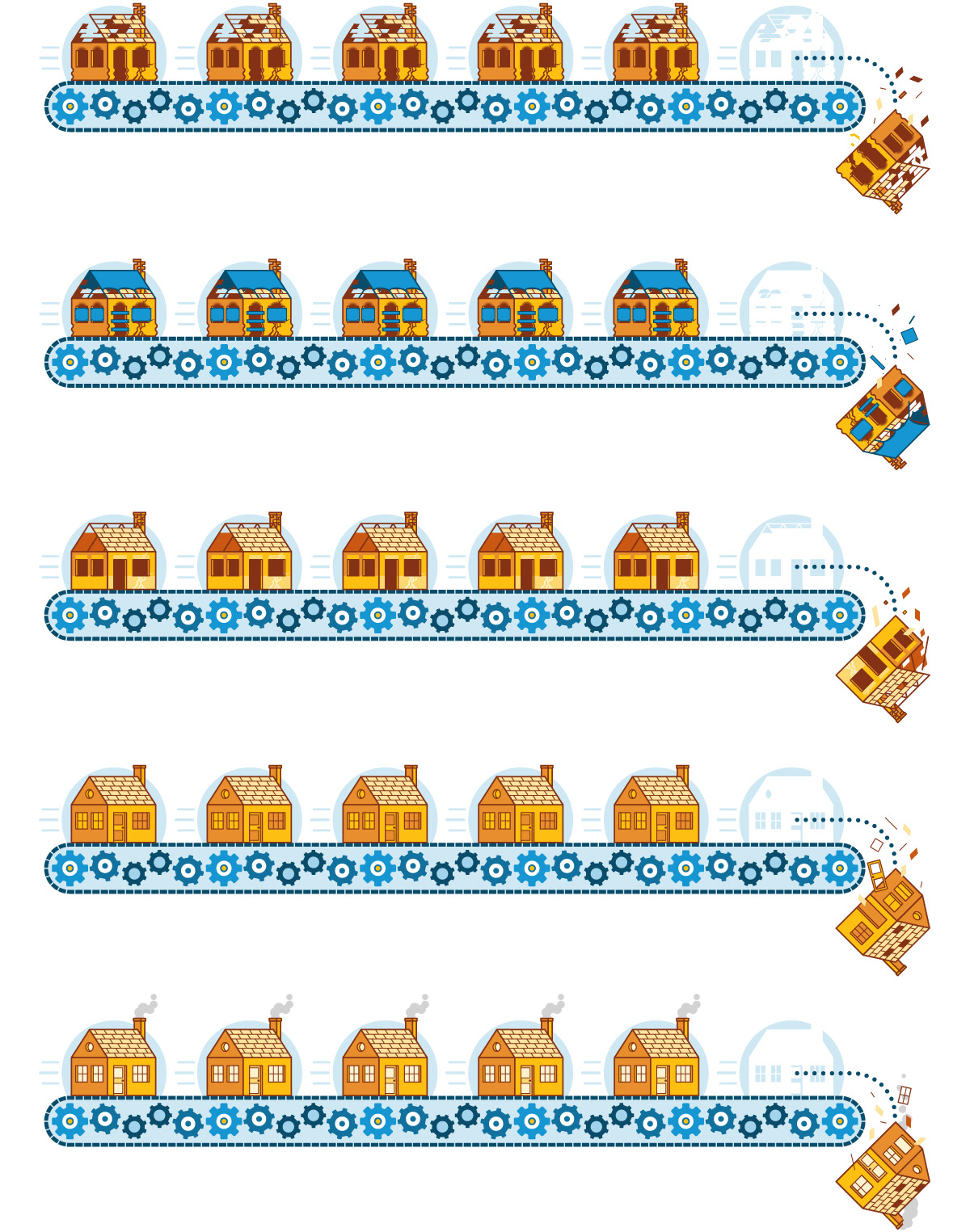
The five posts shown in conveyer belt fashion for use in the blog posts. Each post is made up of multiple stages, and involving various players and scenarios. The last scenario allows for pitfalls, where a homeowner could potentially fall through the cracks in the process, hence the house falling off the conveyer belt.
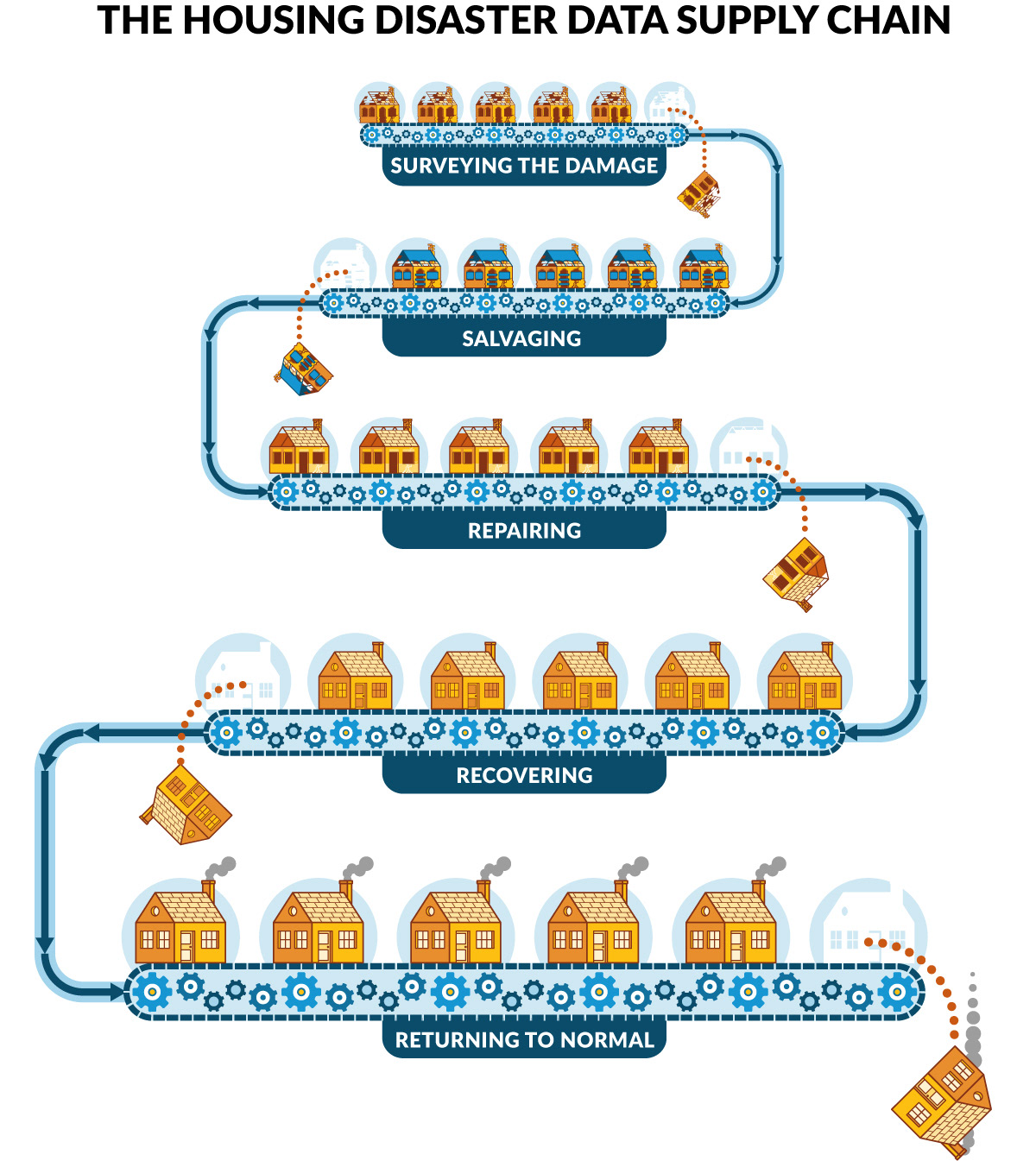
Infographic built for eventual animation purposes, and also to show the tiered structure of the initative.
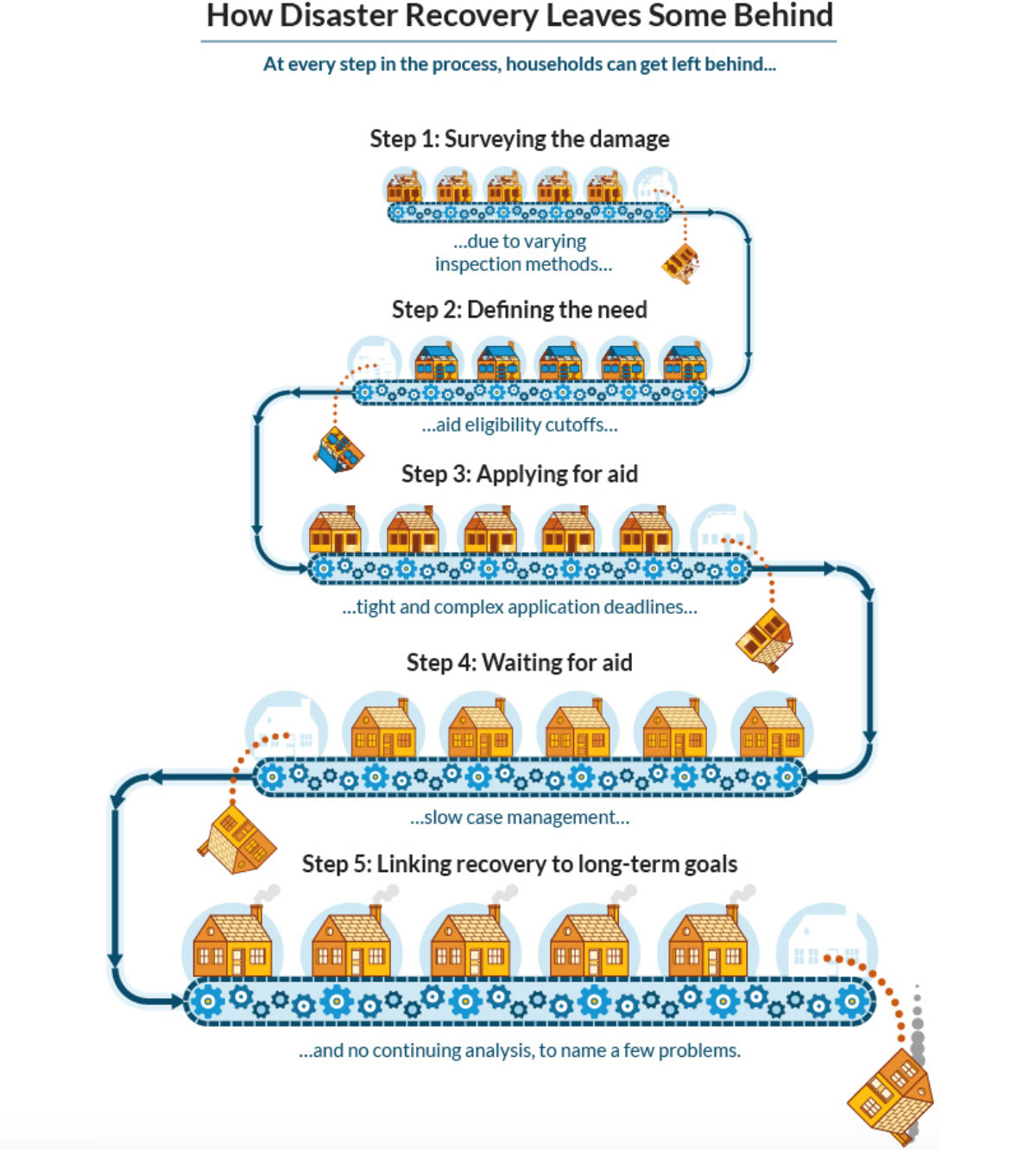
Summery graphic, as used on blog section of the UI's website, preceding the individual posts.
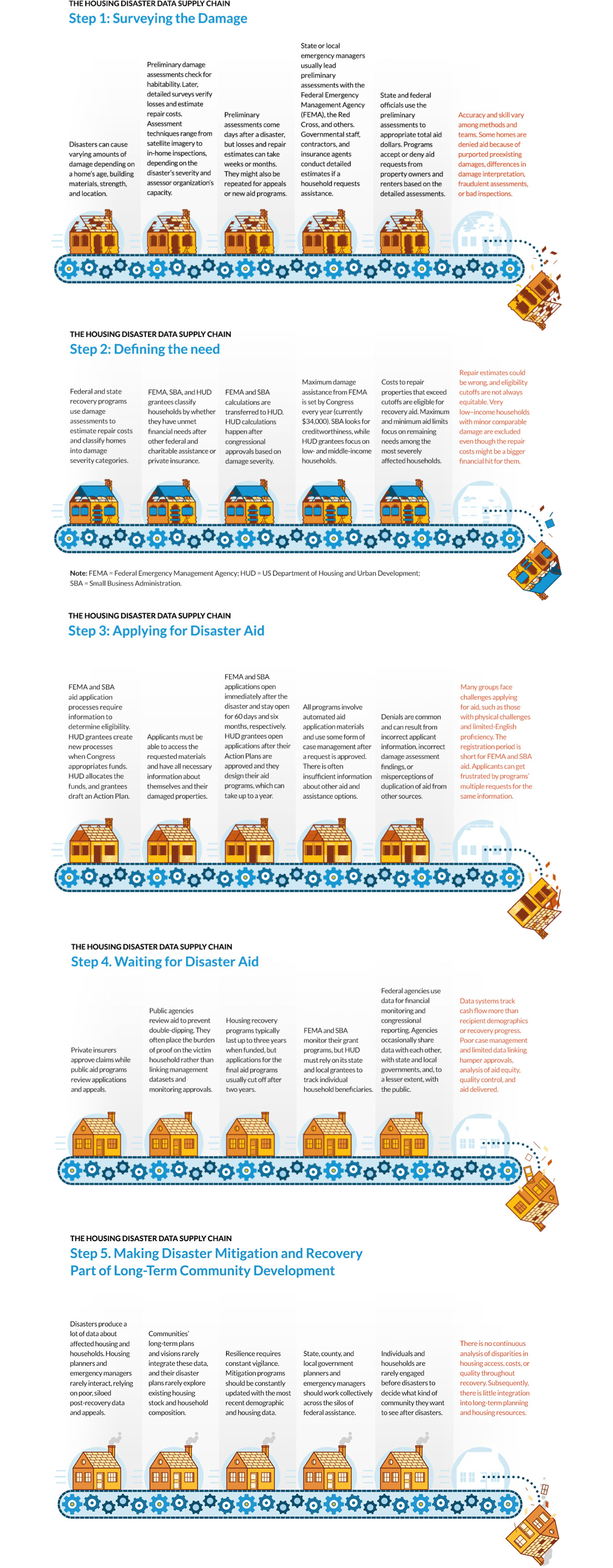
The infographics and icons as used in the eventual blog posts.
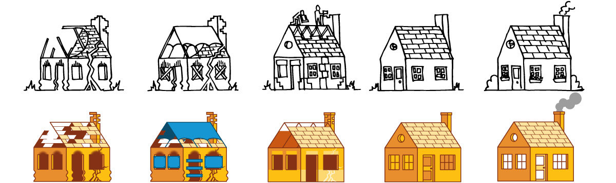
Preliminary sketches, and final versions of houses representing each post. Visualization is as much a product of illustration as it is graphic design, and the doodling/sketching/drawing phase is truly where a textual story becomes a visual story, and where a message goes from being a matter of "what does it mean?" to "what does it look like?", allowing for a greater and broader playing field of thinking, input, and action.